- 각 이미지는 height : 100% 로 지정 되어있습니다.
- 하지만 max-height 의 영향을 받아서 최대 높이가 제한되었습니다.
- 반대 성격의 min-height 도 있습니다.
- 설정을 해제할때는 max-height : none 을 사용합니다.
max-height
CSS 공작소에 방문해 주셔서 감사드립니다. 반응형 예제로 느껴보세요!!
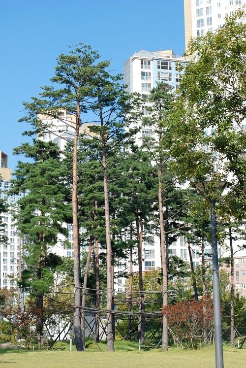
max-height 는 높이의 최대값을 제한합니다.
예제 1
max-height 개요
보기
소스
<style type="text/css">
.css_test {
height : 350px;
text-align : center;
}
.css_test img {
height : 100%;
}
</style>
<div id="css_test" class="css_test">
<img src="http://cfile3.uf.tistory.com/image/2542DB3754DABE1427BAD3" style="max-height:100px;" />
<img src="http://cfile3.uf.tistory.com/image/2542DB3754DABE1427BAD3" style="max-height:200px;" />
<img src="http://cfile3.uf.tistory.com/image/2542DB3754DABE1427BAD3" style="max-height:300px;" />
</div>
사용된 CSS (클릭시 보기) :
heighttext-align
설명
예제 2
실습 - 직접 해 봅시다
보기
max-height 가 각각 다르게 설정된 이미지
설명
슬라이더를 움직여 보세요 ^^
- 순서대로 100px, 200px, 300px 로 max-height 가 지정되어있습니다.
- 순서대로 100px, 200px, 300px 로 max-height 가 지정되어있습니다.
+ 관련 CSS +